Technology / Brand Identity / Odla
Olda
The Challenge
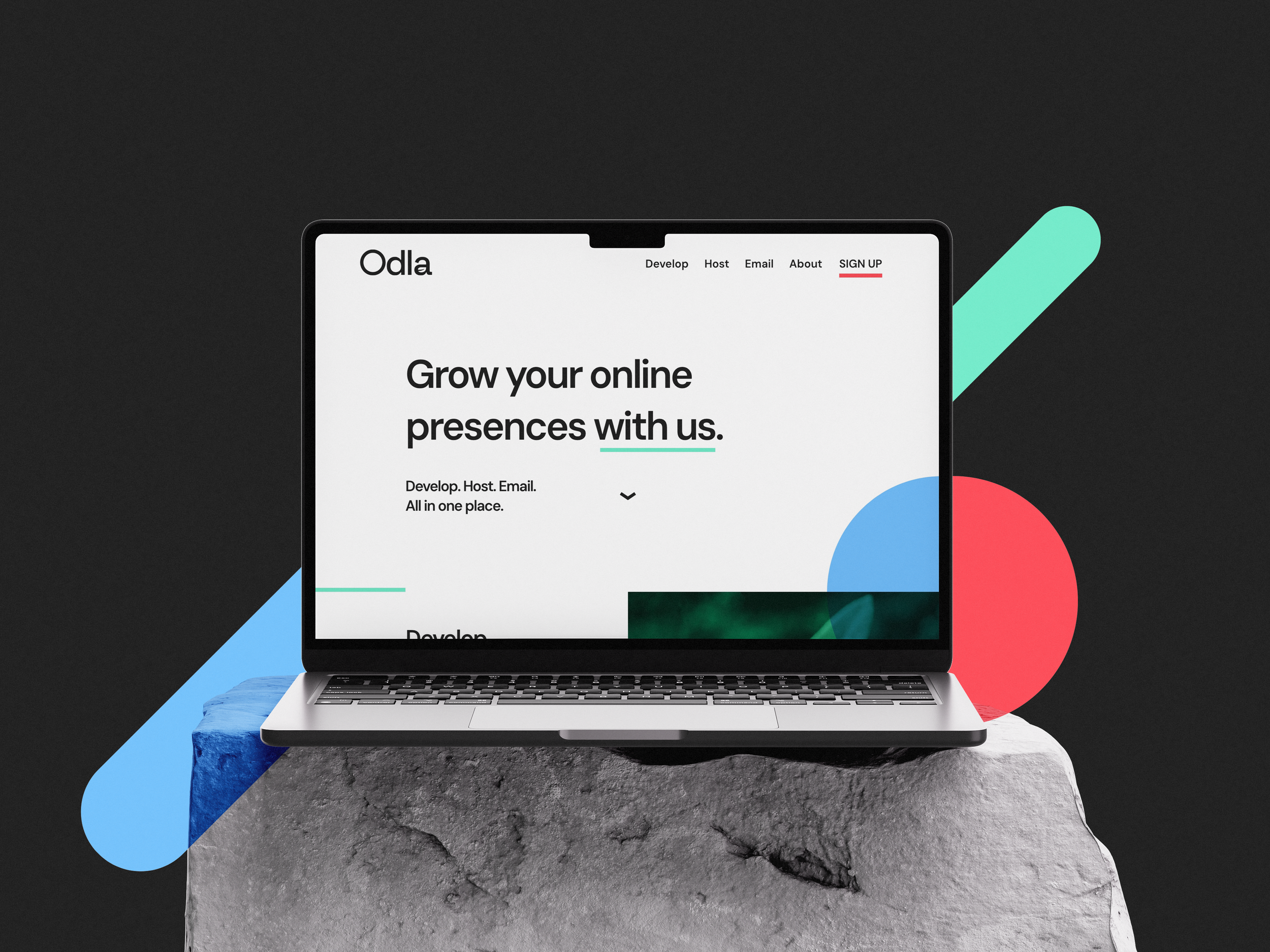
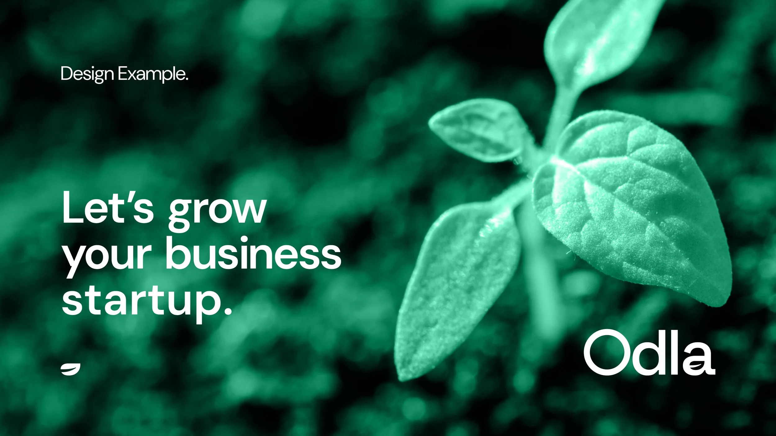
Odla, a web hosting and development start-up, wanted a brand identity centred on the concept of growth. Their mission is to make the internet accessible to small and medium-sized businesses, groups, and clubs, with a focus on supporting local communities. The name Odla, meaning “to grow” or “to farm” in Swedish, informed the visual direction.
My Role
Develop a brand identity that communicates growth, technology, and approachability, blending digital functionality with organic inspiration.

The Approach
I explored the intersection of growth, digital networks, and web technology, while drawing inspiration from Swedish design principles — clean, simple, and functional.
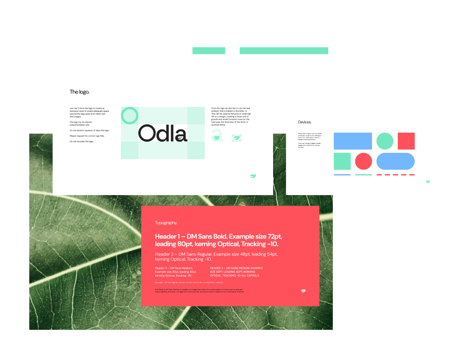
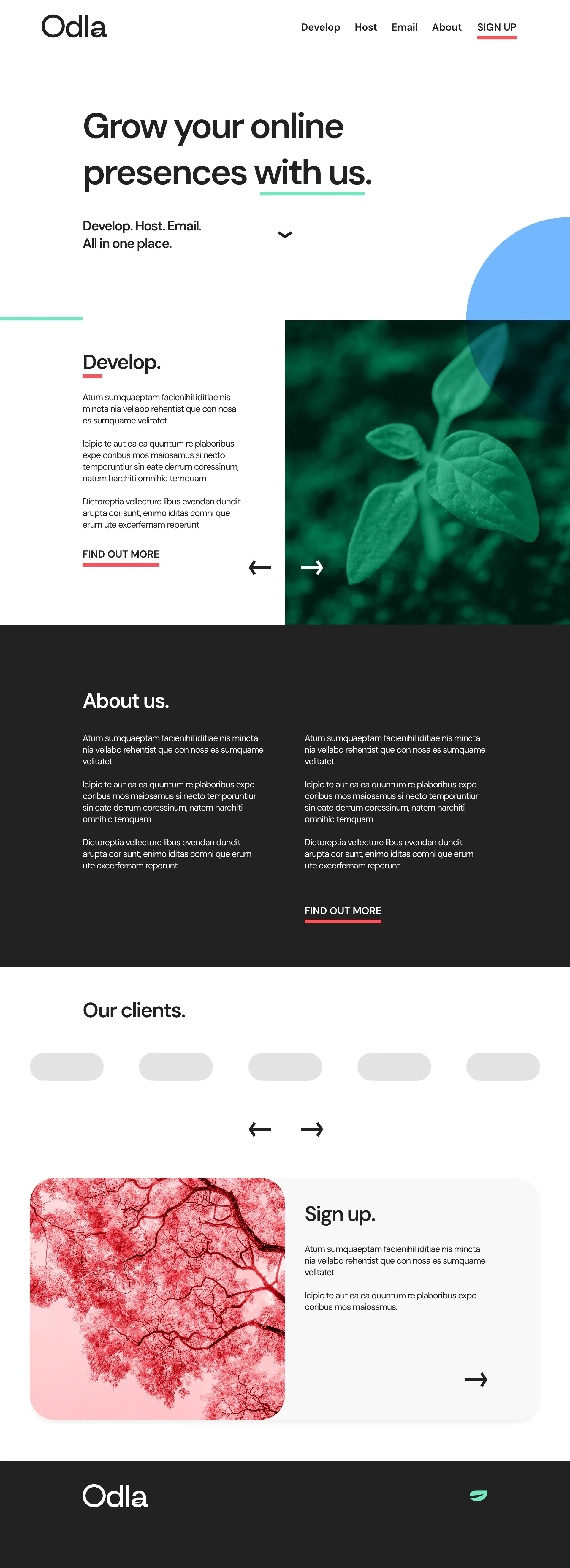
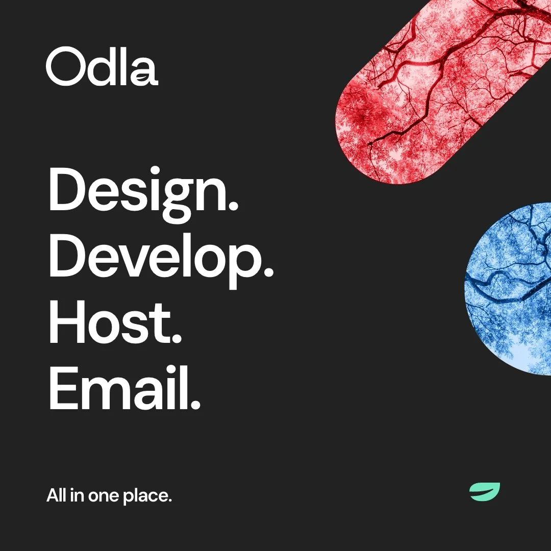
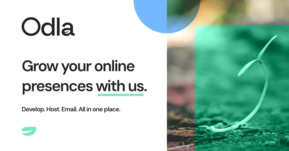
Several logo concepts were developed and presented to the client. The chosen design featured a subtle leaf in the negative space of the ‘a’ in Odla, symbolising growth while remaining minimal and versatile.
The full identity blended the digital and organic aspects of the brand:
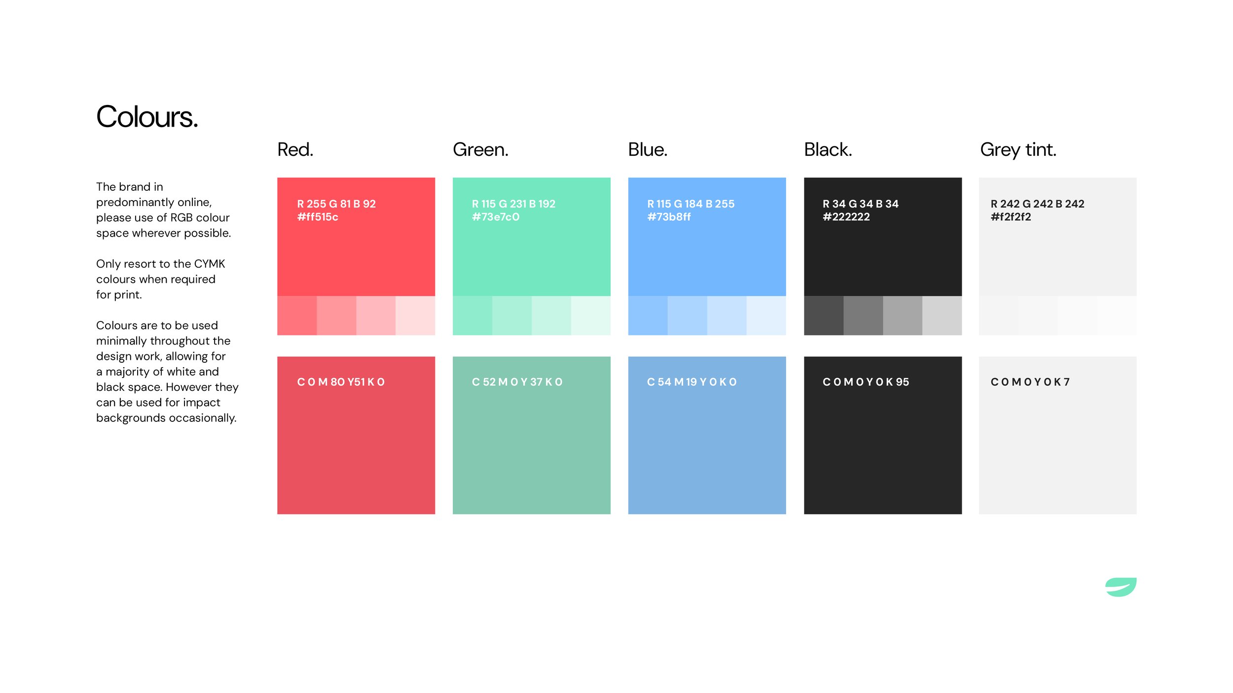
A modern RGB-inspired colour palette
Simple geometric device shapes
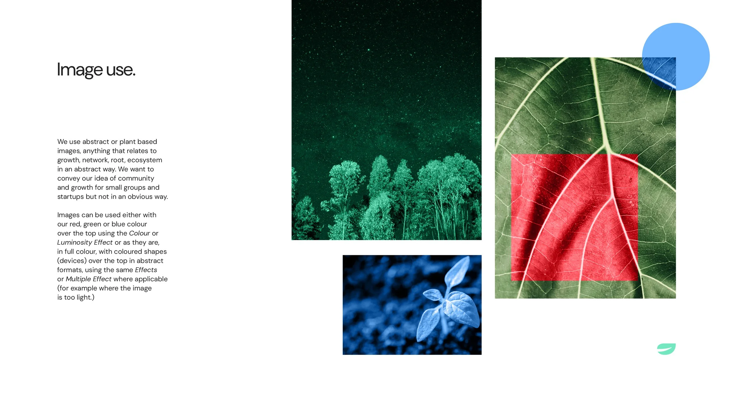
Photography of natural elements, such as branches, leaves, and roots, highlighting networks and growth
Typography, colour, shapes, and imagery were used thoughtfully to create interest and flexibility across applications, without overpowering the content. All elements were compiled into a clear, user-friendly brand guideline.


The Outcome
The result was a clean, clear, and informative catalogue that supported Macmillan Education’s international marketing efforts. The updated design provided a distinct visual identity within the catalogue range while maintaining brand consistency, giving the client a flexible and effective sales tool for a global audience.

Case Studies